You want off subscriptions, but still need client-ready output
You cancel a subscription and the work doesn’t stop. A client still expects clean PDFs, consistent brand files, and exports that drop into a website or a printer’s workflow without drama. Open-source tools can absolutely get you there, but “free” usually means you pay in other ways: setup time, missing polish in common shortcuts, or a file format that someone else can’t open without extra steps. The real question isn’t whether an open-source app can design something attractive—it’s whether your month-to-month jobs can move through it smoothly, from first draft to handoff.
Which design jobs must your toolkit cover this month?
A typical month isn’t “design.” It’s a mix: a logo tweak on Monday, a social set on Wednesday, a one-page landing mockup by Friday, and a last-minute print flyer because someone found a trade show. If your toolkit can’t cover your real mix, you’ll end up reinstalling a paid app for “just this one job,” and the subscription creeps back in.
List your next 10 deliverables and tag each one by job type: raster edits (photo cleanup, background removal), vector work (icons, logos), UI screens (components, responsive variants), light prototyping (click-through flows), and layout/print (multi-page PDFs, bleeds). Then add the non-design requirements clients actually care about: editable source files, consistent exports, and quick revisions without breaking styles.
Be honest about the pain points: if half your work is print layout, a UI-first tool won’t save you time. If most jobs are UI, clunky components will cost you billable hours.
Start with the anchor tool you will open daily
You’ll feel the switch most on the days you open one file, make a quick change, export, and send it back in 20 minutes. That “default” app is your anchor tool, and it should match the work you do most often, not the work you want to do someday. If your week is mostly logo tweaks, icons, and simple marketing graphics, a vector editor should be the first thing you standardize. If you live in UI screens and repeatable components, pick the UI tool first, even if you keep a separate app for occasional vector cleanup.
Choose the anchor by running a blunt test: take one recent job and redo the first hour of it. If you spend that hour hunting for basic actions (align, distribute, export sizes, text styles), you’ll bleed time on every revision. Also check what you’ll lose socially: many clients and collaborators expect Figma files, Adobe PDFs, or “send me the source.” If your anchor can’t round-trip those expectations, you’ll be converting constantly, and conversions are where small errors sneak in.
Once the anchor is set, the rest of the toolkit should fill gaps without changing how you think day to day.
When UI is the priority: can Penpot replace Figma enough?
You take a UI job, open a shared link, and the first request is simple: “Can you update the button states and push a new prototype by end of day?” If your UI tool slows components, variants, or quick sharing, you feel it immediately because UI work is mostly repetition plus tight feedback loops.
Penpot can cover a lot of Figma-style work for small teams: frames, auto layout, reusable components, design tokens, and interactive prototypes that are “good enough” for click-through reviews. It’s strongest when you control the workflow end to end—your files, your libraries, your handoff rhythm. The friction usually shows up at the edges: clients who insist on receiving .fig files, collaborators who live in Figma comments, or teams with mature plugin-heavy systems. Even when the visuals match, the review process can slow if everyone has to change habits.
Before you commit, run one real screen set through Penpot: a component library, three breakpoints, and a short prototype. If that feels smooth, the next question becomes exports and handoff.
How much friction can you tolerate in layout and print?
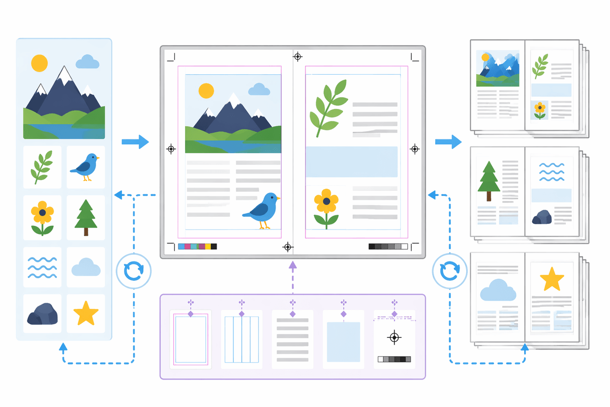
You accept a “simple” print job and it turns into a chain of small requirements: a tri-fold with exact panel widths, a four-page PDF with bleeds, a last-minute copy change that shouldn’t reflow the whole page. Layout work punishes tools that feel fine for single artboards but get awkward with long documents, master-like elements, and precise typography controls.
If layout and print are occasional, you can often get by with a split workflow: build graphics in a vector editor, then assemble in Scribus (or a similar DTP tool) for page numbers, styles, and prepress settings. The cost is time. You’ll spend it importing assets, fixing text wrap surprises, and re-checking alignment after edits. If you do this weekly, that overhead becomes the subscription you thought you canceled—just paid in evenings and rushed revisions.
Run a reality check on your last print deliverable: did you need spot colors, packaging dielines, or a printer’s PDF/X preset? If yes, you’re choosing between learning a dedicated layout tool now or negotiating simpler specs with clients and printers.
Exports, handoff, and file formats that won’t bite later
You finish the design, hit export, and that’s when the risk shows up: a logo that looked crisp becomes soft in someone’s slide deck, a PDF prints with missing fonts, or a developer asks for SVGs that don’t match what you see on screen. Treat exports as part of the job, not a final button. For client delivery, keep a short “safe set”: PDF for approval and print, SVG for vector assets, PNG at 1x/2x for screens, and a plain-text color/type spec so someone can rebuild if needed.
Handoff gets harder when the client expects a native file you can’t produce (.ai, .indd, .fig). You can often bridge with PDF/SVG, but editing power drops fast on their side. Budget time for a round-trip test: export, open it in a different app, and check text, strokes, and overprints. If that feels fragile, the next step is a controlled two-week trial before you migrate anything important.
A two-week trial plan before you fully migrate
You’ll usually find the breaking point on a rushed revision: a font swaps, an export crops wrong, or a collaborator can’t open what you sent. So run a two-week trial like a client job, not a sandbox. Pick one active project (low risk, real deadline) and commit to doing all edits in the new stack, keeping the paid tool only as a fallback.
Days 1–3: recreate one recent deliverable for speed and muscle memory. Days 4–7: build your reusable basics (brand palette, text styles, components, export presets). Week two: do handoff drills—PDF/X to a printer preset, SVGs to a dev, and a “source” package to a non-designer. Track time spent on conversions; if it’s more than you can bill, pause and adjust the toolkit before migrating everything.